 CHALLENGE
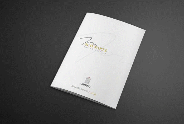
CAPREIT is one of Canada’s largest residential landlords and the company’s growth and success is, in large part, due to the late founder and CEO, Thomas Schwartz. His passion and dedication left a lasting impact on the organization, and a year after his passing, the company wanted to initiate two key projects to honour his legacy.
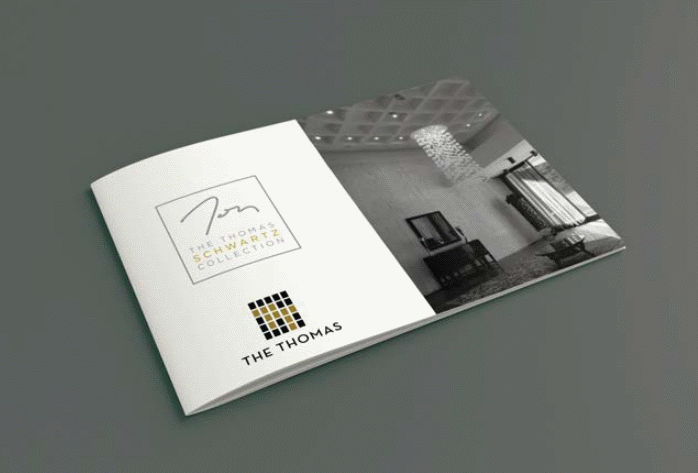
The first was the forming of ‘The Thomas Schwartz Collection’ – a group of 10 premium buildings that are significant to both Tom and CAPREIT.
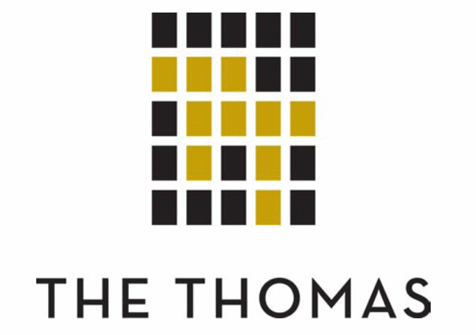
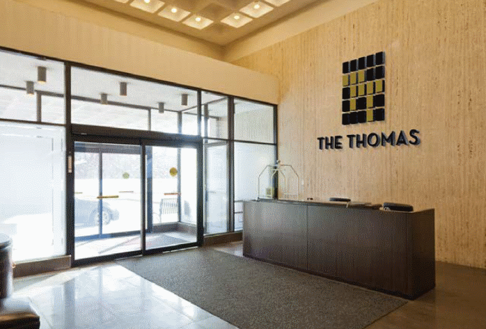
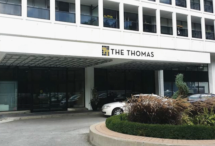
The second was to rebrand Tower Hill – a luxury building at 355 St. Clair Avenue – as The Thomas, in his honour. It was a favourite building for Tom and one of his first acquisitions. The building will also be part of the collection mentioned previously.
What made this a challenging brand identity exercise was that both brands needed to reflect a premium position, maintain their own uniqueness, and graphically/visually connect to the overall CAPREIT master brand.
SOLUTION
The design strategy for ‘The Thomas Schwartz Collection’ was to embody the spirit and character of Tom as a founder, visionary and leader. It needed to graphically/visually connect to the overall CAPREIT brand while reflecting the premium selection of the 10 properties the collection represents.
The design strategy for The Thomas was to be more personal. It was reflection of Tom, his principles and tastes as a leader and entrepreneur. That said, the design needed to be in keeping with the building’s heritage in an upscale, tony neighbourhood.
In both cases, we established a connection to the CAPREIT brand by utilizing The CAPREIT brand typeface and colour.
